Search This Blog

Sunday, May 31, 2020

Preparing introduction- Wix Website

Hello everyone!

In this post I will be write about preparing introduction to my project on my Wix website.

I started to looking for interesting background, frankly speaking I found it immediately.


I found background in in darker shades and these are clouds that flow to establish the current situation in the world, or coronavirus. Gray shades show that it is bad, but dangerously flowing clouds show that everything once passes and may be the sun in the short term.
I found it in bookmarks page background, it was not a difficult and long process, on the contrary it was easy and fast.

Then I started preparing the introduction and Title. I used Add bookmark and  firstly I chose the biggest heading. 


I write VOGUE,because my magazine bears this name and a lot of inspiration derived from this fashion magazine. 


Then I started writing introduction, here I chose heading 1 so that the letters were not so big but were legible.


Here I looked at what opportunities I have to change the text. I changed the font from 22 to 17 because it was too large and the color from black to white to stand out and be comfortable to read.


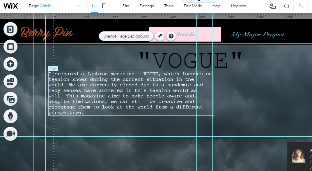
In introduction I described what I prepared and why.


Then I started to insert the project. I started with the Add and More tab. There I found Embed & Website. I used this and pasted there earlier copied flipsnack embed. 


Here I put the project and the end result you can see on my website wix

The whole process was quite fast, it took me max 1 hour and it was easy enough to look in the bookmarks. Of course there are always some problems even with these easy things and in this case also. I couldn't handle the embed code from my non-page insights.


Thank you and see ya!

Jagoda :)

Reference:

Flipsnack.com- https://www.flipsnack.com/

My website- https://czopjagoda3.wixsite.com/website

Friday, May 29, 2020

Creating a fashion magazine

Hello!

In this post I will show you how I created my fashion magazine in Filpsnack.com

After receiving the feedback from the tutor, I started preparing the entire project, i.e. the fashion magazine.

Firstly I started to looking for photos for my cover but I didn't find any. I looking for on free application , like pixabay or shutterstock. Of course I found some photos but none were appropriate. So, I used the skills of my friend Anna Longawa and we took the photos.

When I found the best photos I started preparing the cover.
It was foreground cover, picture found on shutterstock. Fortunately, the design has changed and looks different. You will see how it changed step by step.


Here we can see the final version of the cover with slogans that are designed to interest and encourage the reader to read.  I chose a bright inscription: Vogue to contrast with the colors of the cover and be visible. In the picture I am and I have a protective mask to relate to the current situation, epidemics and poses in front of the door. It also matters and refers to the lockdown, but the styling was spontaneous. I saw what I had in the closet and connected it with myself.


Here we have the beginning of the article and the original version of the page.


Here the final effect of these first pages. I used  different fonts, unfortunately they don't have specific names so I'm not able to give them to you.


I added photos to the article so that the reader can also visually read what he reads.
Everything is in subdued colors and there is a way to make everything transparent and clear. Under the pictures I placed inscriptions indicating the place and author of the photo.


I put references and bibliographies and photo references so that everyone can check the original source.


This application made it easier for me to work on this project, but also made it difficult, because due to the large selection I could not decide but also because of some things I had to look elsewhere than on this platform. 

Here you can see how the whole project has changed.

The end result you can see in the next posts.

See ya! 

Refernce:

Flipsnack.com [ Website] Available at: https://www.flipsnack.com/page-flip-software/editor/ftkfglsi1

Pixabay.com [ Website] Available at: https://pixabay.com

Shutterstock.com[Website] Available at: https://www.shutterstock.com/pl/home

Equipment

Hello

Today I will show you the equipment we worked on.


We used the Nikon camera. It is quite easy to use but to be honest I can't say much about it because I wasn't the one to use it. So what I write are only my insights that I saw during the session.

Our sessions began with the preparation of equipment, i.e. setting and taking test photos. Of course, during the session, we changed the settings to check which would be the best. We took into account the light, location and position. 

I think it's a good adventure and an opportunity to gain experience. However, not everything was great, constantly changing settings or bad photos. One thing I know, photographer's work is hard and requires a lot of creativity.

See you in the next post!

Bye :)

Jagoda 


Research of photos

Hello everyone!

Today I will show you free websites we use to search for photos for the project.


Looking for photos was a real nightmare. Why? Because I couldn't find them anywhere. I search on all free sites I know.

The first site I visited was shutterstock.com 


                                                               shutterstock.com 


This is a site where there is a really rich gallery of graphics on most topics. It is possible to download graphics for free, but if you plan to do something larger to download a lot of photos, unfortunately you have to pay.
However, I did not find a photo that would match the theme of my project.


The next page I was looking for photos is pixabay.com
It is also a free website for downloading graphics, video and even music. This site also has a large database that we can use, and it is also payable but it is possible to use the free period. In this case I also did not find the right graphics.


I decided to use the situation because my friend had to take test photos for the project. So we took some pictures for the cover.

These are the photos from which I chose:


Here you can see the light differences and the color of the mask. This is definitely not a good picture because I can't see any face and the perspective is not good either.


Here is a mind shot, I wanted a photo close up because most VOGUE magazines have a photo on the cover up close - close up or mind shot. The light is okay, but I also didn't like the cover.


Here you can see a slight difference of light between these pictures. The second picture is  clearer, which makes it a bad picture,the subject is too far to see at once.  I am standing on it, which is also not interesting enough. However, the first picture seems to be the most appropriate, because of the light, pose and perspective that shows my attitude and see the specific message.


The whole adventure of taking pictures was pleasant, the weather was fine, places also fit our thoughts.However, admits the work of a model is not an easy job, you have to know when and what outside will fit the location, the changes in position were still a match. But also it was difficult at first because the places where we took pictures were populated so we couldn't show off something nice. Now I see that postcards are always the most difficult, because when we were doing a lot of photos each of us was more courageous and with less stress we approached it. Ultimately, I liked posing for the camera but of course I'm not a professional. It was a great adventure and I already gained some experience.


See ya in the next posts!

Have a nice day :)

Reference:

Pixabay.com- pixabay.com

Shutterstosck.com-  shutterstock.com 

Wednesday, May 27, 2020

Writing process

Hello

Today's post will focus on my writing process.

Frankly speaking, I wrote my article within 11 hours one day. It looked quite strange, because I locked myself in the room and sitting 11 hours constantly looking for inspiration and writing. I believe that this was not responsible behavior on my part. I always thought that articles were written days or even weeks, and I wrote them in one day. However, on the other hand it was the best experience. Why Because I have proven myself that I am able to write something in a few hours and that I can focus enough to stick anything together. 

Of course, it was a match but I only felt it when I finished. It was strange, while writing as if I was in a trance, I am also looking for inspiration. I was looking because the topic of the project changed so I had to start again. I also had a multitude of doubts and depressive thoughts that I can't make it or I don't know how to write it so it would be really good. But there were also good moments when I thought it was good that I could do it and finally finished and I was proud for writing it all at once.

I wrote in a draft only so I used a regular Google document to write. Is a good and useful tool and a plus is that it saves all changes by itself. Unfortunately, I don't count words, so from time to time I pasted text into the world document.


This is a screenshot of google docs.


Searching for inspiration was also not easy, because a lot of pages wrote something different and I was afraid to find evidence that confirmed one of theses. The whole process was very busy and annoying because recently I have problems with my laptop. So every page or browser closed by itself and by writing.

I was inspired by articles about this year's fashion week and interviews on coronavirus and more. Unfortunately, it was difficult because the situation is saint so I could not support myself with books but I think and I hope that I managed this task and I am proud of myself.

if you are curious what adventures I had while preparing the whole project, I invite you to read the next posts.

See ya!

Jagoda 

:) 


Sunday, May 24, 2020

Mind Map

Hi everyone!

I would like to show you my Mind Map which I prepared to develop my project.
while creating it I used the Canva. com application.

Canva has a very rich temples database, so there is plenty to choose from. However, many nice things are paid so we have to deal with it and not everything is free. But this does not change the fact that there is really a lot of choice not only for creating mind maps but also for other graphic things, for example, posters or iconography. By creating something we have a choice of photos and love, music, text or elemental choice which is a great solution.


My mind map presents all the tasks I have completed to create my own article. In this post, I refer to each of the entries listed.


In the center we have the inscription Vogue because my article is to be modeled on it and bears such a name. I put him in the middle as a goal. Then we have the inscription Fashion week and coronavirus, because the article is about fashion weeks in the largest fashion cities during the current situation in the world, and as viruses. I conducted in-depth research on this subject in order to have as much knowledge as possible and to have information from various sources in order to limit myself to one point of view. 
Next, I have research of journalists, because I can't imagine creating, writing an article without knowing other people who are good at it. You can learn a lot and get inspired to develop the project.  Of course, before I started this research, I had to go through hard work, because looking for the right idea is not easy and comes with time. Then I did research on fashion articles that would be most helpful in the project and I analyzed them in many angles, such as language, structure, style and visually.
I prepared a draft plan that made my work much easier, because I separated the work for weeks, so I knew what to do when I should do it. Then I continued my research and examined the photos for the article and the application she used to create this project. It was also helpful because I knew the pros and cons of the application and I already knew how to use it so the work was faster.  

And so, all these activities led me to create the article and the entire fashion magazine, which will appear in the next posts.

while doing each of these things, I will give you a multitude of time and patience, because something is always going wrong with every project, which makes us doubt in ourselves but also there are also good times in which something comes out and we are proud of ourselves. That was in my case.

In te next posts you will see the continuation of my work and finally the final result, so I invite you to see the next posts. See you soon !


Reference:

Canva.com- https://www.canva.com/q/pro/?v=13&country=uk&utm_source=google_sem&utm_medium=cpc&utm_campaign=REV_UK_EN_CanvaPro_Branded_Tier1_Core_EM&utm_term=REV_UK_EN_CanvaPro_Branded_Tier1_Canva_EM&gclsrc=aw.ds&&gclid=CjwKCAjw8J32BRBCEiwApQEKgTRpWyRJQhPl-GCPM81f7nsdgwh_uCBiD-5s1lpHLDfNp011bszBTBoC0x8QAvD_BwE&gclsrc=aw.ds


Friday, May 22, 2020

Change of project idea!

Hello 

My project idea was changed , because of  want to touch the current situation and also pay attention to the fashion.  

In the current situation of the coronavirus, the fashion industry has also suffered. Fashion shows have been canceled or postponed, what's going on? spald demand so a warm market. 


My article will be about fashion weeks in the biggest fashion cities like New York, Milan, Paris and London. It will make my readers realize how serious the situation with the virus is even in the fashion world and encourage them to be more creative and to change that each of us is afraid of. "We needed this terrible event to make us understand that it was a necessity to change," says Anna Wintour, head of vogue. 


I will not write here so as not to reveal the details and encourage you to read my article shortly. However, more information will be also in the next posts.

See Ya!! 

:)


Reference:

WINTOUR, A. (2020) [Citation] Available at: https://www.polsatnews.pl/wiadomosc/2020-04-27/moda-w-cieniu-pandemii/ 


Friday, May 15, 2020

Anna Wintour- Journalist

Hi 

Today I show you the next journalist- Anna Wintour.


Anna Wintour is a both British- American journalist and editor who has become editor in Chief on Vogue from 1988 and artist director in Conde Nast (AAE Speakers, 2020). It could be true information, we have a specific date. "Wintour is arguably the most commercially minded editor ever. She has parlayed US Vogue's position as documenter and badge of acceptance to the place magazine with the industrie's commercial heart"(BOF,2020). According to Encyclopedia Brutannica Anna Wintorur became one of the most influential figures in fashion. She has contributed to development of many people, including the 1990s genaration of supermodels.
Each of the above information may be true due to the date given and reliable source. Opinions are confirmed and issued by experts so we do not have to deal with the opinion of an ordinary person.


               Anna Wintour


When I'm looking at this photo I see Anna's professionalism and chaos, but it's because of the people in this picture. When it comes to the person of Anna Wintour I feel unsatisfied and her excitement, even if  she cover her eyes with glasses that are part of herself.


Due to read her articles for VOGUE I find out how correctly I should write about fashion, She became a motivation for me.I hope that after doing more research I will be able to do my project well. Her knowing also enrich my project, because she has a lot of information about fashion world because of its position in this world.

See ya !

Have a good day!


References:

BOF (2020) Anna Wintour [Website] Available at: https://www.businessoffashion.com/community/people/anna-wintour 

ENCYCLOPEDIA BRYTANNICA (2020) Anna Wintour [Website] Available at: https://www.britannica.com/topic/Vogue-American-magazine  


Thursday, May 14, 2020

VOGUE

HELLO

In this post I will be analyse the cover of magazine  VOGUE.
I will do this to correctly create my own magazine cover.


The cover has  subdued colors, shades of green and brown. It goes well together, gives a breath of freshness and soothes. However, these colors can be depressing, giving the knowledge of sadness.
The most striking is the huge white VOGUE inscription on the very top of the cover.  I think that white color is a good idea because it does not mix with other colors and is very visible, which works positively.
Then the month is given, the inscription is barely visible.
The figure of the model is completely on the cover,  she has messy hair, which can introduce some chaos. Her face is directed towards the viewer, which also makes the potential reader pay attention. All inscriptions are given on the sides, which makes it transparent, simplistic and minimal.  The colour inscriptions are different, black and white, it is pleasant but it can make someone perplexed, why such colors? why this color to this topic? 

I noticed that usually the number on the covers of magazines must appear, I think that  it attracts a lot of attention and forces you to read. There are also names of people who can be read inside the magazine. 

Looking at this cover I feel as if the model's eyes are piercing me deeply, this means that I cannot leave the magazine indifferently and I must pay attention to it. I also have a bad feeling when this look is fixed on me, asking for reading. 

see you in the next post !

Bye :)


Reference:


Flipsnack- research

Hello

Finally the time has come to do research on the site where I will be preparing my article,and thus we are approaching the end of 3 therm. 
I chose  the Flipsnack.com website to work on my project, because I used to work on it before and it worked well despite a few inconveniences. I will explain below what I mean, but first I will show you what it really is and what this website is for.

Flipsnack.com " is an online, browser based publishing tool used by people from all around the world to create and publish digital catalogs, magazines, brochures, portfolios, reports, photo albums, newspapers and many other types of publications"(Capterra,2020). 

This site has a huge database of templates in every field, for example I used the fashion magazine template. Unfortunately, this is a paid site but there is a solution to this situation because the application allows you to use it for free for a month. It is also quite detailed because it explores who the potential customer is and what he does. This can be positive, because you can see from Estron is a professional and care for their clients to be safe, but also negative, many people at first glance to ask questions that concern him withdraw and it is natural, but this may discourage the potential person. However, when it comes to the graphic design it is fine, everything works together nicely and is pleasing to the eye. Everything is legible and understandable. 


Unfortunately, not everything works well and the graphics base is not amazing. This can limit and extend working time.  Working on my project, I spent a lot of hours looking for the right graphics, which I did not finally find on flipsnack and noticed that the application does not have some important things. for example, personally I had a problem for my header to cover graphics. It is tiring and annoying. However, I personally encourage you to use this platform. She delighted me with videos that help how to create a given project. It is a big simplification of work.


According to Eduarlo L. (2020) this is very good indeed and  Flipsnack allows  to share the file and  have the contents organized. However, I found the negative opinion about the service "Awful customer service. Clearly outsourced overseas and with little knowledge of the product. No phone number available to call. Waste of time"(Dan c. , 2020).
I think, however, that it all depends on the person, one passion for other things and the other. 


See ya in the next post!

Bye :) 

Reference:

Flipsnack.com- https://www.flipsnack.com/?fs_tags=Capterra,Publishing&utm_source=Capterra&utm_medium=ppc&utm_campaign=Capterra_Publishing

Capterra- https://www.capterra.co.uk/software/176854/flipsnack

Dan C. -https://www.capterra.co.uk/software/176854/flipsnack

Eduarlo L.- https://www.capterra.co.uk/software/176854/flipsnack 


Sunday, May 10, 2020

ELLE- Farfetch Has Launched A Rare Chanel Collection From The Eighties

Hello

This post will be article analysis. I would like to analyze article from Elle about fashion from the eighties. 

I will be analyze step by step not to miss anything. 

The first thing that catches the eye is the big picture which shows two female figures dressed in a chanel collection. The picture already suggests what the article will be about. This is not usually photo because it is plywood of pictures. It makes that our attention is focused twice. Something is happen, something interesting, intrigunig. The author of the photo used subdued colors, shades of beige and black. However, used a large element of red which also means that the viewer will not go past the graphics. 


https://www.elle.com/uk/fashion/a32398718/farfetch-has-launched-a-rare-vintage-chanel-collection/


I noticed that the author of the text - Amy De Klerk uses informal language, because the words are not pronounced, the author depends on a comprehensible and friendly message. The article contains quotes, due to which we are sure that the author is a reliable source of information. We have detailed and comprehensive information about the topic. For example, Amy provided specific information, such as, data and money.

When  it comes to the structure of the text, it is divided into short parts. It makes that the viewer want to read.  The article is short  and  fashion ads appear, if the viewer pulls into the subject and suddenly the article ends, it may leave no taste and disgust this magazine. Fashion adverts are annoying because they distract me, yet I know they are needed to advertise and encourage the reader.

At the end of the article, the author encourages you to buy what she wrote above. it is also accurate in providing specific prices and product images.


In the next post I will be compare the 70s and current fashion, so I invite you to
see it. 


Bye :)


Bibliography: 


Elle (2020)  Farfetch Has Launched A Rare Chanel Collection From The Eighties [Article] Available at: https://www.elle.com/uk/fashion/a32398718/farfetch-has-launched-a-rare-vintage-chanel-collection/ [Accessed 7 May 2020]. 

Wednesday, May 6, 2020

Project Plan

Hello 

Today I will show you my Project Plan.

This was created on Piktochart.com


See you soon!! 
Have a good day!


References:

Piktochart.com(2020)[Aplication] Abailable at: https://piktochart.com/

Project Plan (2020) Available at: https://create.piktochart.com/output/46358951-my-visual 


ELLE

Hello 

This post is about one of the fashion magazine :ELLE

ELLE this is a women's fashion magazine established in France in 1945 by Pierre Lazareff and his wife Helene Gordon (Encyclopedia Britannica, 2020). 

Elle also has articles on other topics, such as News, Beauty, Life + Culture , and Horoscopes. This magazine has an extensive database of information, so I invite you to check.
"In the early 21st century Elle had the largest readership of any fashion magazine in the world, with culturally specific editions published on six continents"(Encyclopedia Britannica,2020).


                                                          elle-magazine-may-2020

The photo presents the cover of Elle from May 2020, So it's the latest copy.
Already here you can see certain outline of the 70s fashion, pay attention to the cut of the shorts. However, it's a combination of modern and 70s fashion.

The cover of magazine contain many elements.  You can see that the magazine contains a large database of information, but you can see chaos here. We doesn't know what to focus on, but it can also encourage viewers to become readers.


           Casual Summer Days
Here we see the 70s fashion.  Short, colorful shorts resamble 
the cut from the photo above. However, on the cover of ELLE you can see only one color - black, while here we can see different colors mixed together. 


In the next post I will be analyze one of the article from ELLE.

See you in the next post!
Have a good day. 


References: 
ELLE(2020)[Magazine] [Availabale at: https://www.elle.com/uk/

ELLE (2020) Elle May 2020 [Magazine] Available  at: https://www.hearstmagazines.co.uk/elle-magazine-may-2020

Encyclopedia.com (2020) Gordon-Lazareff Helene [Website] Available at: https://www.encyclopedia.com/women/dictionaries-thesauruses-pictures-and-press-releases/gordon-lazareff-helene-1909-1988 [Accessed 23 Mar 2020]

Encyclopedia Britannica (2020) Elle [Citation] Available at: https://www.britannica.com/topic/Elle-French-fashion-magazine 

IMDb(1990-2020) Pierre Lazareff [Website] Available at: https://www.imdb.com/name/nm1334678/

VINTAGE DANCER (2020) 70s Style Ideas for Women [IMAGE] Availabe at: https://vintagedancer.com/1970s/70s-outfit-ideas/